| Pagina's in het onderwerp: < [1 2 3 4 5 6 7 8] > |
Call for Site Testers: ProZ.com has a new site navigation that needs your test driving De persoon die dit onderwerp heeft geplaatst: Nate Hill
|
|---|
Nate Hill
Verenigde Staten
Engels
+ ...
ONDERWERPSTARTER | Thanks, everyone! | Jul 14, 2017 |
To everyone who has tested and commented here, thank you for your kind and helpful feedback.
There were many comments regarding design and functionality outside the scope of the navigation. More site modernizations are coming so please keep your eye on this forum for any post mentioning "Site modernization" or testing opportunities. Working with the community to explore how we can continually improve on these newly released areas will be an ongoing theme for a while, and I look forw... See more To everyone who has tested and commented here, thank you for your kind and helpful feedback.
There were many comments regarding design and functionality outside the scope of the navigation. More site modernizations are coming so please keep your eye on this forum for any post mentioning "Site modernization" or testing opportunities. Working with the community to explore how we can continually improve on these newly released areas will be an ongoing theme for a while, and I look forward to working with you all. ▲ Collapse
| | | |
I like it! I have always thought the old menu is too small and not clear enough, and I'm happy to see this has been improved with the new design. And I like the way that the sub-menus are displayed when you hover over the menu, rather than having to click/open new tabs with the old menu.
| | | |
Lingua 5B 
Bosnië en Herzegovina
Local time: 15:22
Lid 2009
Engels naar Kroatisch
+ ...
| More modern look. | Jul 14, 2017 |
The navigation seems smoother, the design looks sleek, the colors are better.
The top bar "Switch back" and "Discuss the new menu" is distracting, but I guess it's just there temporarily.
This is just after a few minutes of browsing, of course I can't test all the features quickly, but for now I can definitely see an improvement. Good job.
| | | |
| dans l'ensemble le lifting est réussi.... ceci étant je suis d'accord avec Nate Hill à plus ! | Jul 14, 2017 |
Dan Lucas wrote: Nate Hill wrote:
The ProZ.com site navigation has had an overhaul, and I'd like to ask the community to take it for a test drive. The menus are fine, but please remove the large orange Update button. I am already a paying member. I don't want this distracting graphic element floating in my line of sight. It is not used on the navigation menu for the existing site. Regards, Dan
| | |
|
|
|
Ahmet Cigil (X)
België
Local time: 15:22
Turks naar Engels
+ ...
I like it very much except for the Upgrade button for already paying members!
| | | |
ALPTranslations
Argentinië
Local time: 10:22
Lid 2017
Engels naar Spaans
+ ...
| Looks much better | Jul 14, 2017 |
If you could apply this new look to the whole site, that'd be great, it looks like a 90's website.
| | | |
Meta Arkadia
Local time: 20:22
Engels naar Indonesisch
+ ...
| One tiny little problem... | Jul 16, 2017 |
The new version doesn't scale down correctly anymore to tiny (4") screens.
Cheers,
Hans
| | | |
Nate Hill
Verenigde Staten
Engels
+ ...
ONDERWERPSTARTER
Meta Arkadia wrote:
The new version doesn't scale down correctly anymore to tiny (4") screens.
Cheers,
Hans
Hans, I fixed one place where I saw it not scaling down enough. Please let me know if there is somewhere specific you're still noticing an issue. Thanks!
| | |
|
|
|
... just do away with that upgrade button and you're good to go?
But seriously, you need to hide it under the homepage button or support button.
Olly
| | | |
| One little problem | Jul 18, 2017 |
Natanael de Paula Sousa wrote:
In my humble opinion, this new menu is more organized and even better looking than the older one. I'm not smart enough to have something to add to it.
The only problem that I've found was the fact that we can't come back to the home page. The "home button" doesn't do that.
[Edited at 2017-07-18 15:49 GMT]
| | | |
Tom in London
Verenigd Koninkrijk
Local time: 14:22
Lid 2008
Italiaans naar Engels
| I won't upgrade | Jul 18, 2017 |
I notice a number of people have already said this:
Please cool down the bright orange "upgrade" button. It kind of looks like a come-on, an invitation to click on it. Some kind of trick. I don't like that. What actually happens if we click on it?
[Edited at 2017-07-18 16:46 GMT]
| | | |
| Give it a try..... | Jul 18, 2017 |
Tom in London wrote:
I notice a number of people have already said this:
Please cool down the bright orange "upgrade" button. It kind of looks like a come-on, an invitation to click on it. Some kind of trick. I don't like that. What actually happens if we click on it?
[Edited at 2017-07-18 16:46 GMT]
.... and you know.
| | |
|
|
|
Samuel Murray
Nederland
Local time: 15:22
Lid 2006
Engels naar Afrikaans
+ ...
Nate Hill wrote:
Please provide your constructive feedback on this post. `
The new design's nav burger has better-looking cascading effect. The old design allows for a narrower screen before reverting to a nav burger.
| | | |
| missing functionality | Jul 19, 2017 |
with the new menu, this is the dialog i get when i choose the search client option in the relevant field on invoice creation
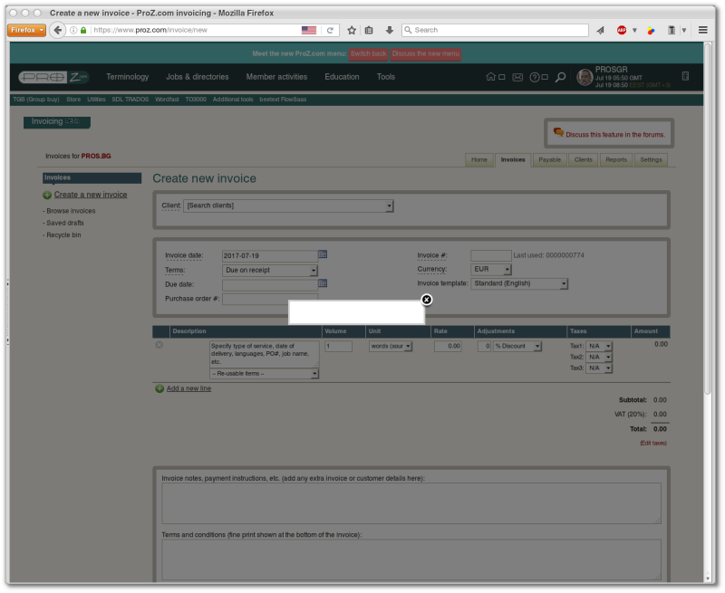
[Edited at 2017-07-19 05:55 GMT]
| | | |
Nate Hill
Verenigde Staten
Engels
+ ...
ONDERWERPSTARTER | Upgrade button update | Jul 19, 2017 |
Tom in London wrote:
I notice a number of people have already said this:
Please cool down the bright orange "upgrade" button. It kind of looks like a come-on, an invitation to click on it. Some kind of trick. I don't like that. What actually happens if we click on it?
[Edited at 2017-07-18 16:46 GMT]
I've updated the button. For all paying members, it will no longer be shown.
For free level members, the button will be hidden for 90 days after you click on it. ProZ.com is continuing to make a number of updates to the features and services offered on the site. So even if you're fairly certain you'll never upgrade, checking in on that page every 90 days can serve as a good way to see what has changed on the site. In addition, with any new service, there is usually a free level of usage, which means you may learn about new features there that may interest you.
| | | |
| Pagina's in het onderwerp: < [1 2 3 4 5 6 7 8] > |